Stocky Pro provides the tools to run your business smarter and more efficiently
Integrated Solutions
Simple yet powerful
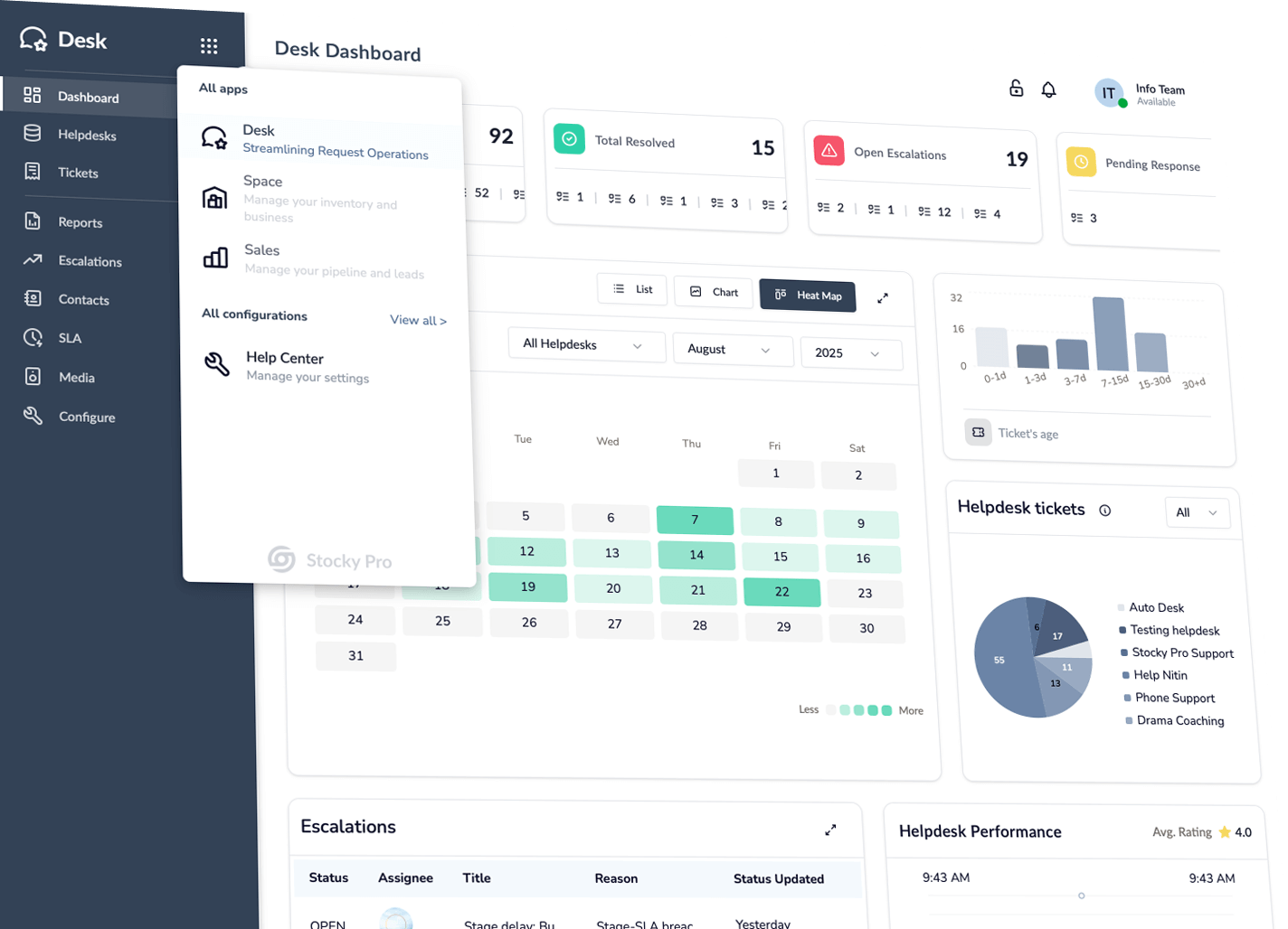
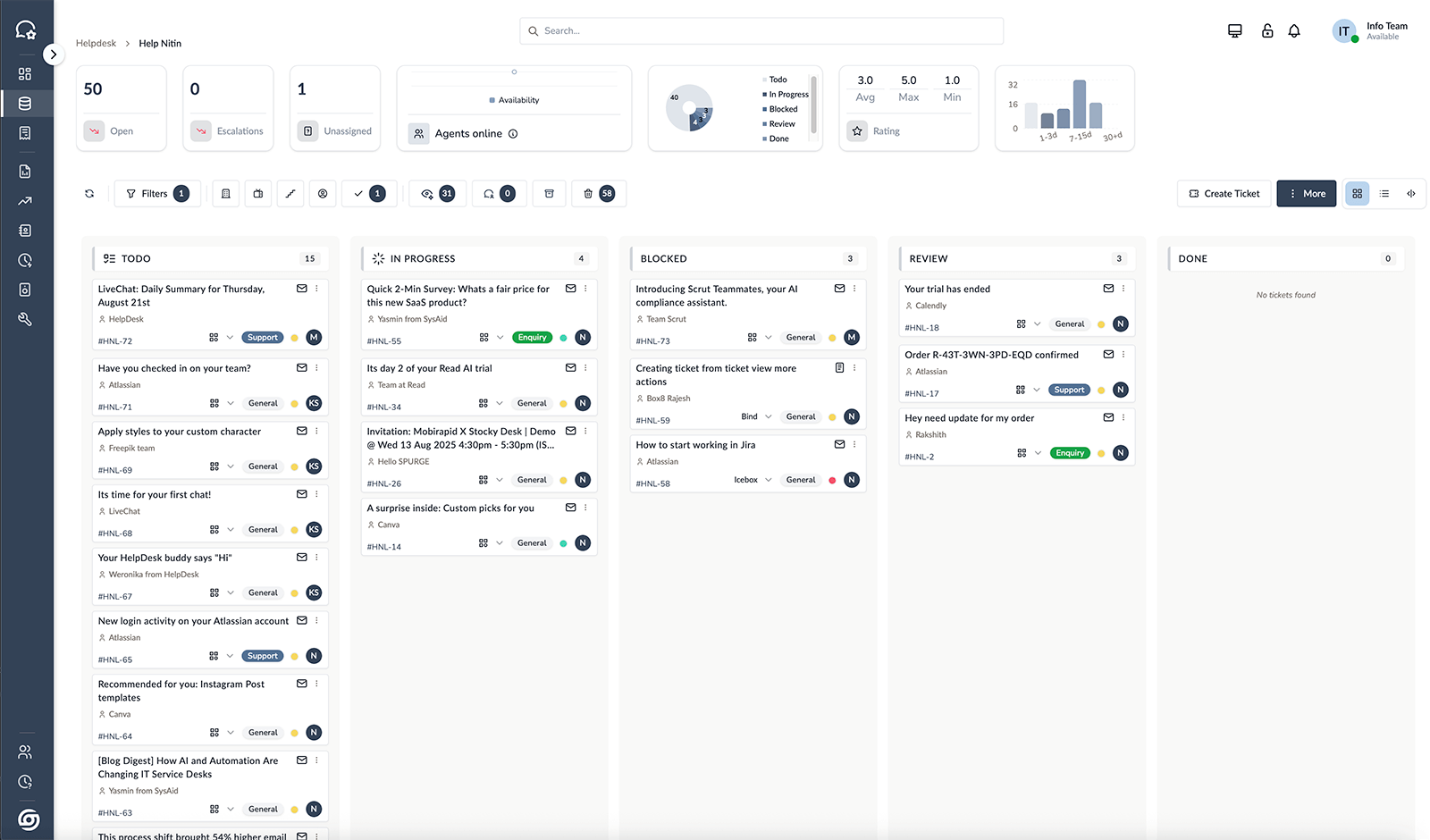
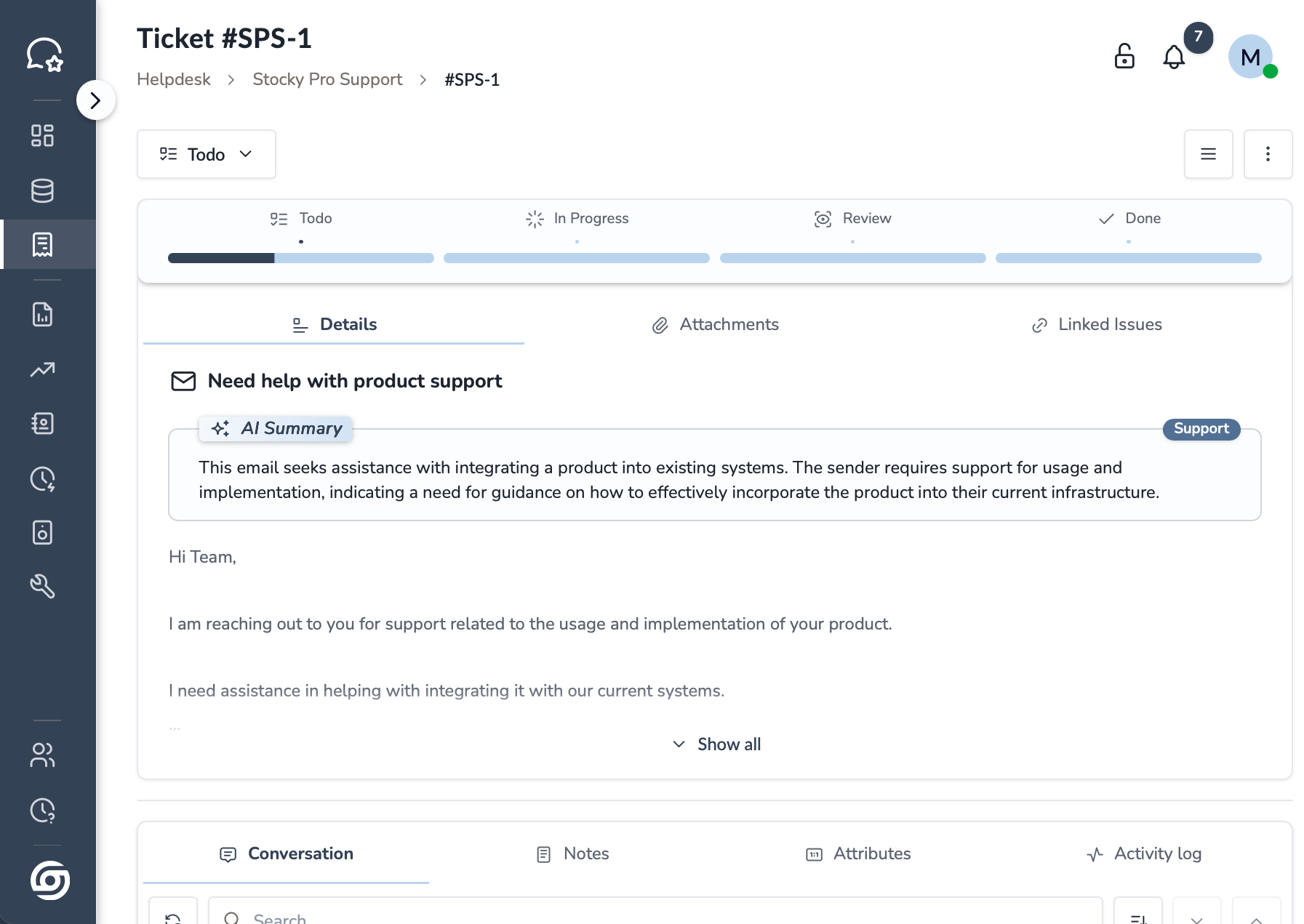
Stocky Desk
All your support in one place—track, assign, resolve—every time.
Stocky Space
See every product’s stage and stock—clear, real-time flow.
Stocky Leads
From lead capture to quotes—AI-ranked and tracked, Multi-pipeline
Stocky Orders
Universal orders: ingest anywhere, track stages live.
Stocky Project Management
Projects, tasks, owners, timelines—status at a glance.
Stocky Assets
Company-wide asset management—track, assign, audit, lifecycle.
Stocky Finance
Universal accounting & finance—billing, invoicing, ledgers, reports.
Stocky Productivity
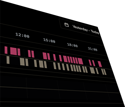
AI-powered insights into employee efficiency and workflow health.
Stocky HRMS
Universal HRMS—simple yet powerful for people operations.
Stocky Procurement
From request to PO—catalogs, approvals, GRN, 3-way match.
Stocky Contracts
Create, approve, e-sign, renewals & reminders.
Stocky MDM
Endpoint device management—laptops, mobiles, and other devices.
Glimpse of the Apps
One simple suite for ops: Desk centralizes support; Space shows product stages & stock; Sales captures and closes deals; Orders unifies service/sales from quote to delivery—live status, owners, SLAs.
Real Intelligence
This gives you control
Stocky Pro is a connected suite for everyday business usecase. Each module solves real problems with automation, in-house AI (we don’t train on your data), and a simple, reliable UI. No third-party services power our core. From startup to enterprise, run complex workflows easily.
Mission and Vision
operating system for businesses
A decade in business operations
We’ve worked with 1,000+ companies and seen inefficiency, leaks, and common day-to-day operational problems.

A decade building scalable software
We’ve built complex solutions for over a decade, using a scalable approach that grows with your business.

Designed with love
Secure & compliant
Dedicated per-account DB
Your own encrypted database and datastore, isolated per account—always.
Region-based clusters
Choose data region; clusters and servers stay where you need them—period.
Auto backup & recovery
Automatic backups, point-in-time restore, and quick recovery built-in.
ISO 27001:2022 listed
ISO 27001:2022 registration tracked and maintained with full transparency.
GDPR-aligned operations
Built to GDPR principles for robust data protection across stack—always.
App & network security
Defense-in-depth on app and network layers, monitored 24/7 with alerts.
Trusted by leading MNCs
Deployed and trusted by global enterprises (MNCs) across globe.
Clear data privacy policy
Clear privacy policy and strict data-handling practices you can trust.
No surprises—all included
No hidden fees; everything in your plan is included, always.
In-house AI, private LLMs
We run in-house AI models and LLMs; your data never trains our models.
No third-party reliance
We rely on no third-party services; we operate the entire stack ourselves.
Easy, open integrations
Connect Stocky to your apps, APIs, and sites with simple, secure hooks.
Built, Not Wrapped
From Scratch, For Impact
We don’t wrap third-party or open-source tools. We design and build Stocky Pro from scratch to solve real problems—without bloat or dependencies. That’s how we deliver deep, direct value. We believe in crafting the best solution; it’s our mission and vision..

What is our mission?
Expanding worldwide to simplify work
Cut noise and busywork across the whole business support to finance so people can focus on real work. Work that’s connected, measurable, and calm software that just works.
Get Stocky Pro Now !
Available on web, Mac, and Windows.
Sign up for a free 30-day trial. We handle setup, config, and support—free forever.
